Creating Distilled
By Andi Gladwin - Tuesday, May 12, 2020
I have now produced the artwork for over one-hundred Vanishing Inc. books (that's enough books to stack floor to ceiling in my office!). While every book looks and feels different, I always start with the same question: what should this book feel like? That often leads me to consider the texture of the cover and paper, and the size and shape of the book.
Because I can't mock up a physical copy of the book at this stage, I tend to produce a digital mockup so that I can confirm with the author that it fits. Here's the starting point of Ryan Plunkett's new book, Distilled:
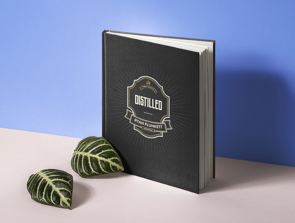
While it doesn't always happen, I think we got the perfect feeling quite right here. Here's what we eventually settled on:

Back to blog homepage
Similar posts on the blog: