How to Design a Custom Deck of Cards
By Harapan Ong - Sunday, March 5, 2023
Ever wondered how much work goes into creating your own custom deck of playing cards?
One of our favorite card magic creators Harapan Ong had a chance to experience the entire process firsthand as he worked with designer Mike Davis to bring the bestselling "Harapan Magic Playing Cards" to life. It was a fascinating journey, with many learnings along the way, that Harapan has kindly agreed to share with us.
Please enjoy this fun conversation between Harapan and Mike as they discuss everything from finding inspiration to how to be a good client when working with a graphic designer.
Creating Your Own Custom Deck of Cards
A conversation between Harapan Ong and Mike Davis
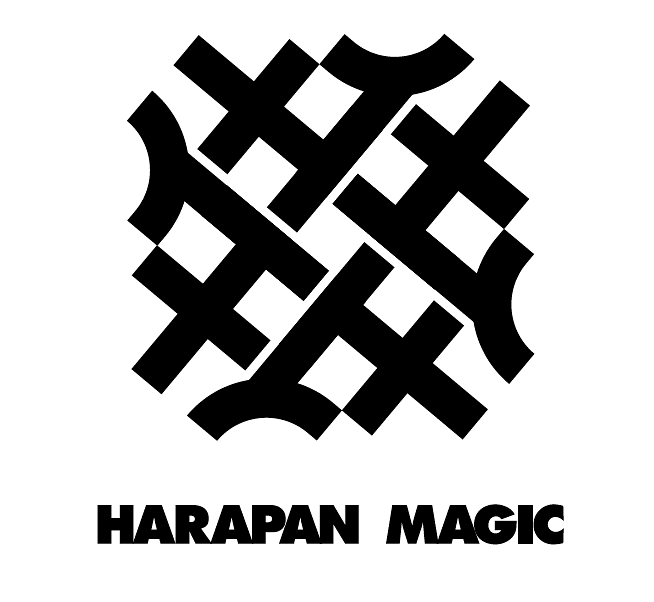
Harapan: So, the design of “Harapan Magic Playing Cards” is based on the Harapan Magic logo, which you also designed. Can you take us through your design process, particularly for that logo?
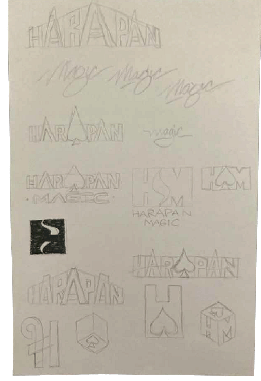
Mike: I always like to start on paper. I sketch out every idea that comes to mind, even if I feel like it won't work. Every now and then, one of those early scrapped ideas will come back to spark something useful. So my general rule is that there are no wrong answers at first.
I love typography and playing with letterforms, and the first thing that jumped out to me about your name was the three evenly placed “A”s. That immediately offered a lot of potential, especially when you consider an “A” could also represent the Ace.
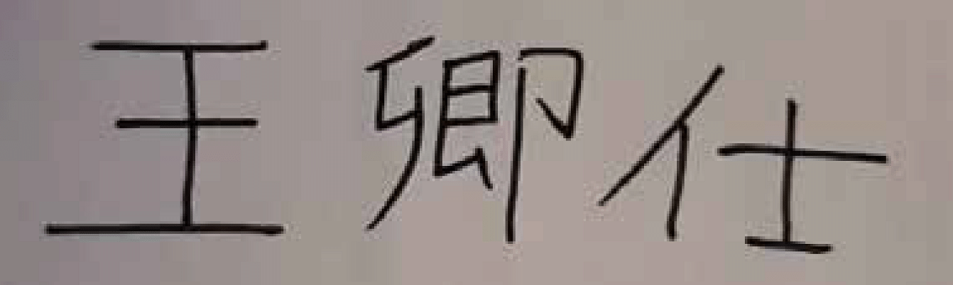
I tried a few things with the H.M. initials for Harapan Magic as well as some illustrated icons representing both your magic and scholar background. None of these seemed to hit the mark. Then you showed me what your name looked like written in Chinese, and that really got the ball rolling.
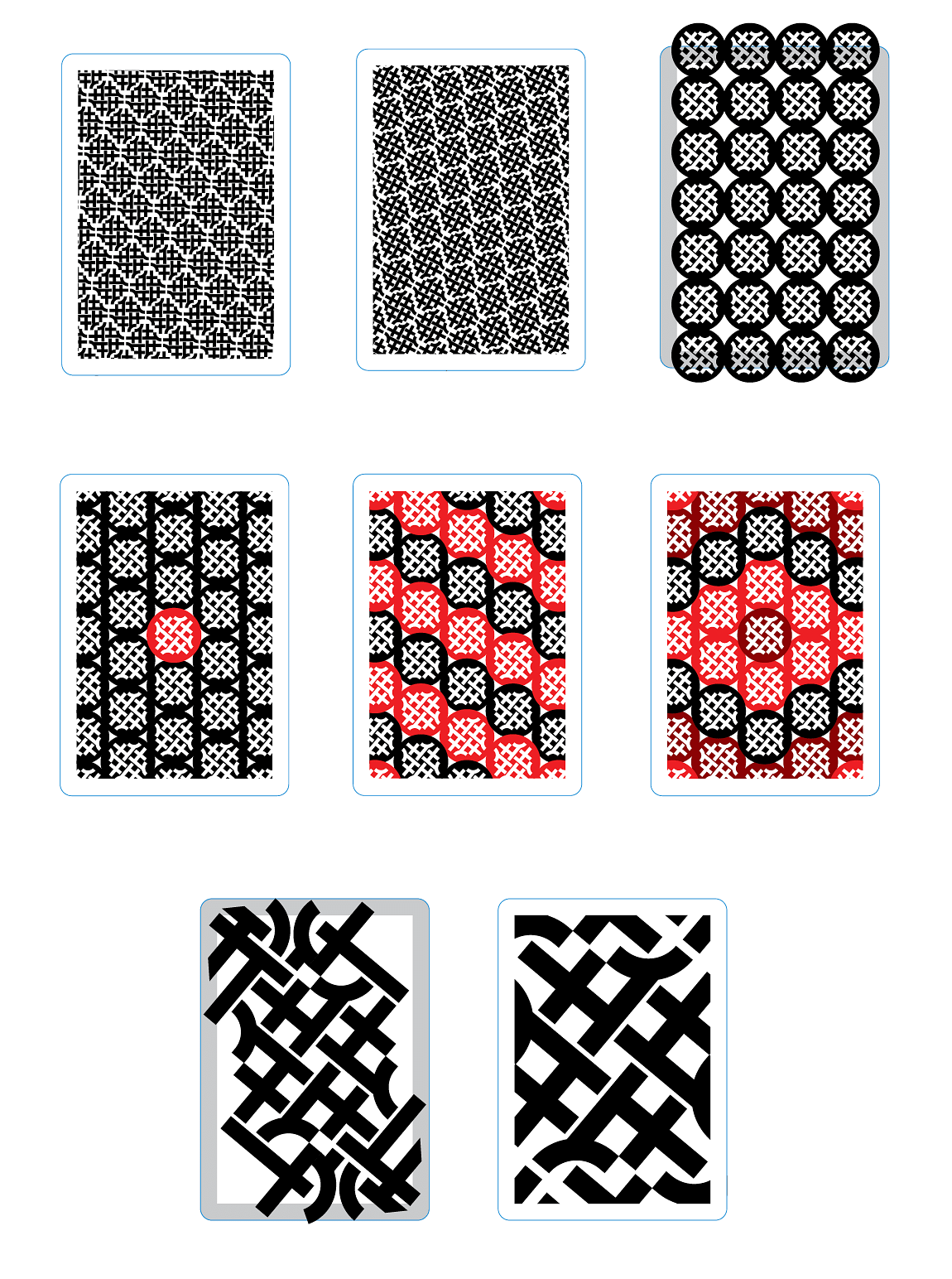
The first letter was too simple and the second too complicated. But the third one was just right, so I began exploring different styles of illustrating and presenting that character. In a circle, with pointed and rounded edges, thick lines, even thicker lines, and then, ultimately, repeated in a sort of pinwheel pattern.
We both agreed that this was the way to go as it had some nice ambiguity that didn't make it drown alongside generic magic logos. There were some really interesting things happening within all of the interlocking lines, but let's be honest—it was probably the subconscious reminder of apple pie that really sealed the deal, right?
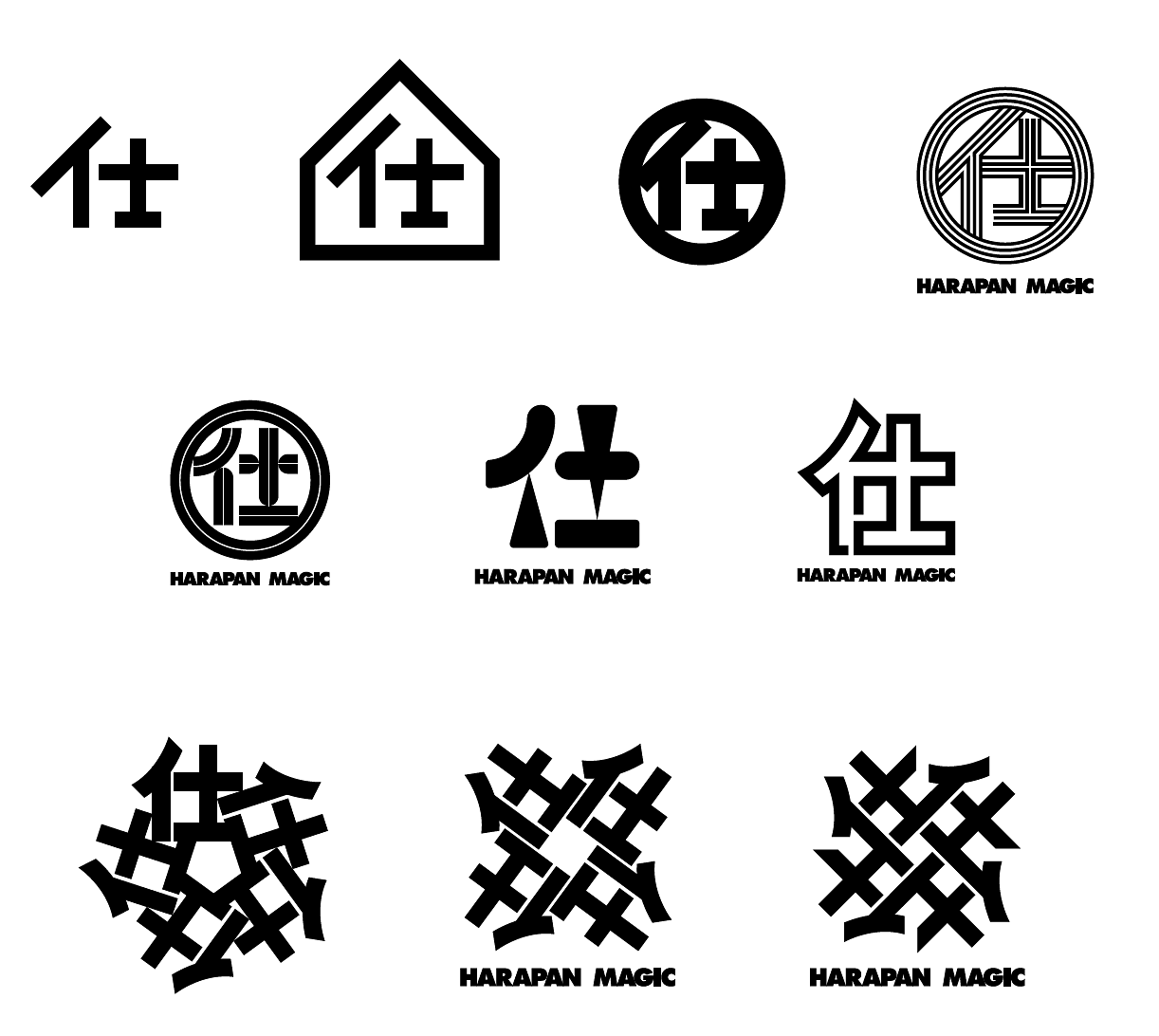 Harapan: Haha! Yes, I do remember joking around that the pattern from my logo did kind of look like the lattice on a traditional apple pie, or even a waffle. Eventually, I came to the conclusion that it was the logo I wanted because it looked abstract, bold, timeless, and yet also strikingly simple. Plus, it has a hidden meaning in using an important character from my Chinese name, which I think sets the logo apart from every logo out there in the magic market. My brother even pointed out that it kind of looked like an Asian Celtic knot, which I really liked.
So how did you transition from the logo to designing a deck of cards based on that logo? I remember there were so many different styles and designs you were playing with, so I am curious about your thinking process here.
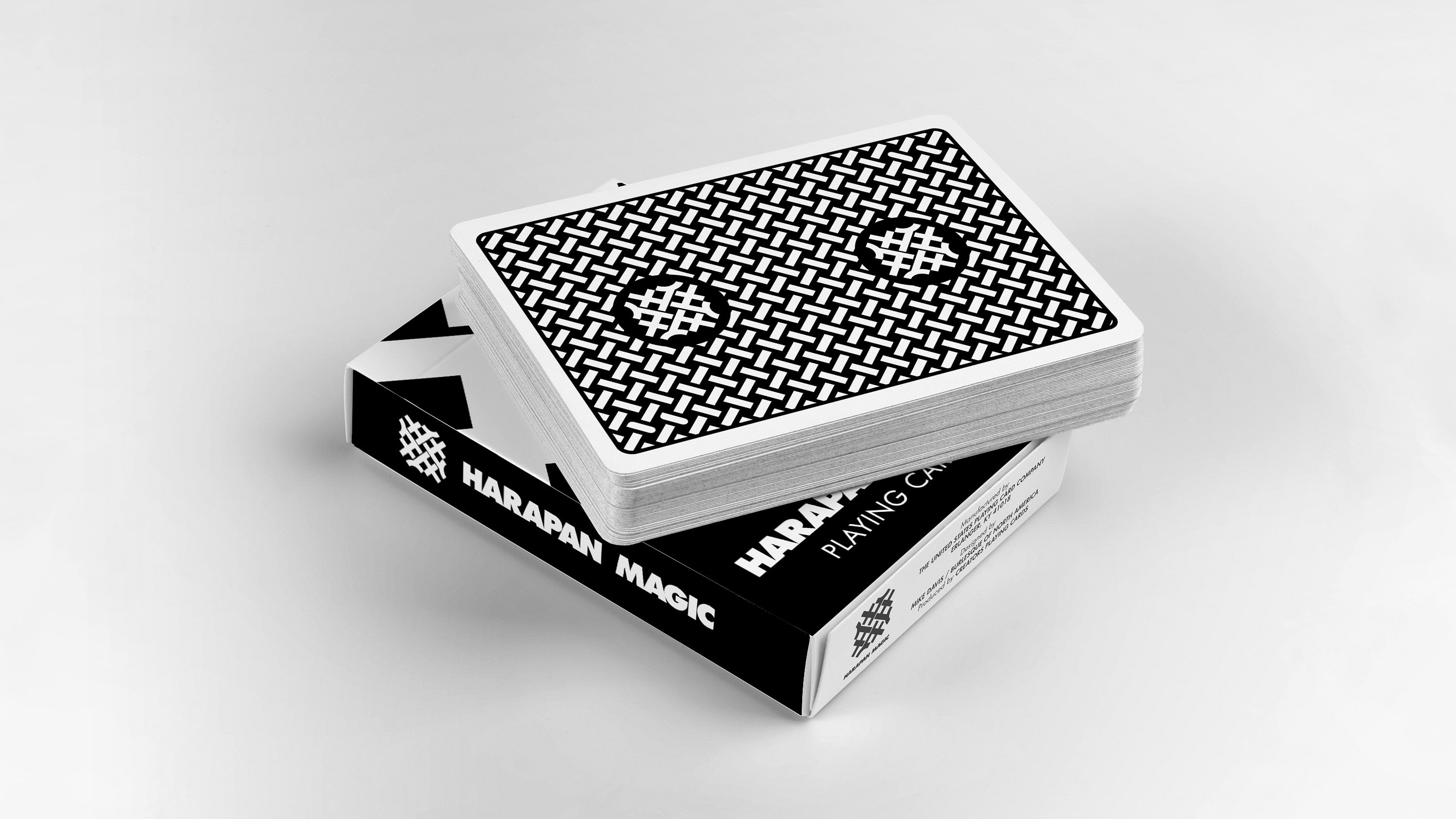
Mike: With the logo locked in, I tried a few different ways to fill the back of a playing card by rotating, shifting, and scaling the logo in different ways. Again, no wrong answers at this point—just experiment and discover what's working.
At some point, I abandoned the entire logo and tried focusing on the lattice pattern at its core. I really like the simplicity of the backs of Bee playing cards and felt we had the makings of something just as strong. I tried a few different weight variations until landing on one that felt right, then adorned it with a pair of Harapan Magic logos to tie everything together.
Harapan: Yeah, and I remember that the apple pie / waffle joke we made to each other actually came into play in the final design as well as we ended up repeating this apple-pie-esque lattice across the whole back, which created a really simple and classic-looking deck.
Since you're a professional graphic designer, I wonder if there has been any skill / thought process / design philosophy that's been unique to designing a deck of cards as compared to designing other things in your professional work, like logos, T-shirts, posters etc.
Mike: Every design project I take on is completely different and I always like to begin with a wide range of ideas at the beginning so I don't trap myself into thinking there's only one solution. For a deck of cards, the functionality plays a huge role in how I approach the design. I know that it has to look good at a small size (it's not a movie poster) and function in a way that's useful for card magic (is it a perfectly symmetrical two-way design?) while not completely isolating laypeople (for example, can your Aunties still use the deck to play Cribbage?).
How about you? Did you come into this with a specific direction in mind? Decks you've seen that served as a good jumping-off point? Lessons you've learned as a card magician for what will and won't work in a deck design?
Harapan: I mean, I don’t have a lot of experience with designing a deck of cards. My only deck that I’ve ever had a hand in designing was the "Newton Deck" that was offered as part of my project "Opticks". As I wasn't really experienced in deck design, I heavily relied on my designer friend Stefan Eriksson, who did a great job with that deck.
My creative process for that deck was largely a process of elimination. Because I didn’t know exactly what I wanted, I started by looking at his initial designs and discovering what I did NOT want. From there, I grew to understand what I wanted in a deck of cards that I would use on a daily basis. And I certainly applied many of those lessons to the "Harapan Magic Playing Cards."
For example, I realized that I wanted a deck with a back design that was simple and in a way, understated. I think bright and loud colors with extremely eye-catching designs have a place in the playing card community (especially for cardistry), but when I am performing my magic, I want the focus to be on the performer and the experience of magic and wonder happening.
At the same time, having too simple a design did not work for me as well because when spectators do take a closer look at your cards during a performance (whether it is to inspect for any gimmicks or trick cards, or just out of curiosity), I do want them to appreciate the beauty of the cards, and not just see a solid block of color with no other features.
I think that was the philosophy I had going into working with you on the "Harapan Magic Deck." The back design is simple and understated enough to not be a distraction, and yet at the same time the interlocking lattice and the logo had just enough intricacy and elegance to intrigue the audience if they were to examine the design.
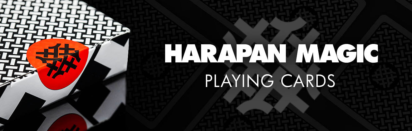
For the tuck box, I had the opposite idea. I wanted an eye-catching design for it so that the moment I take the deck out of my pocket, people are drawn to the gigantic overblown logo on it. However, once the deck is out and the box is kept, they should then focus on the performance and nothing else.
Since we’re here, I am curious about another thing: how was the experience for you working on this deck? I've always read these crazy horror stories online from designers who have worked with clients "from hell" who make unreasonable demands that end up destroying the beauty of the designer's vision. I certainly hope I've not been such a client.
Mike: Come on now Harapan, you've been an angel throughout this whole process. I'll save the "clients from hell" stories for another blog post cause it's a doozy.
Some clients will show up with a whole batch of their own drawings that they just want me to clean up on the computer. ...Nope. No thanks.
Others will have no ideas at all and tell me to just make something that looks cool, then will suddenly become inspired to guide the design in hyper-specific and often completely nonsensical directions as the project moves forward. Nope. I'll pass on that too.
In an ideal situation, the client gives input on what they're looking for, but will trust the designer to use their skills and knowledge to make the best decisions. I would say you did a good job of seeing my ideas, determining what was working for you and what wasn't, and then expressing that to me clearly. It's almost like you're a teacher or something and you're used to explaining things in a way that makes sense.
Harapan: Phew! I’m glad the whole experience has been positive.
In a similar vein, how do you balance your own vision for a product (such as this deck) with the client's vision and requirements? This is because when I create a trick, it's kind of just my own vision that I have to worry about. But for you, I am curious to know how you strike the balance between those two sides—your own vision vs. your client's demands.
Mike: I think for every creative profession, there is a certain level of compromise that should happen. A good designer knows they're not working like an independent artist and will have to put the client's needs front and center rather than pushing out an idea that they believe just looks good.
But, I'd also argue this is even true in card magic.
You say it's your own vision you have to worry about, but aren't you thinking about how the audience will perceive a trick when they see it and making adjustments with that in mind? Does the progression from initial premise to final reveal make sense? Are there moves that you really want to use, but need to alter due to angles or timing issues?
Well, same with design. Sometimes there's an idea that I feel really strongly about (three perfectly-spaced "A"s) that will never see the light of day because it just doesn't work with what the client wants. Does that mean it's a bad idea? No. It's just not the best solution for this problem. But, maybe it will get featured in a blog post about design process one day.
Harapan: Alright, final question. What is your favorite design feature about the "Harapan Deck"?
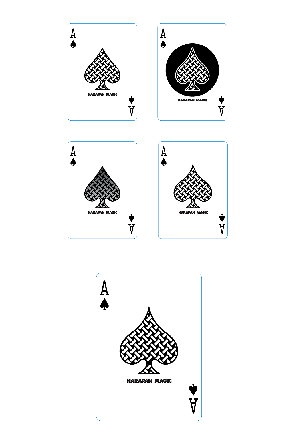
Mike: I really enjoy seeing how the back pattern has grown, both in a literal and metaphoric sense, out of the logo. It's clean, effective, and if I may be bold enough to say so, I feel it stands up alongside some classic deck designs. Am I allowed to talk about your super secret marking system?
Harapan: Nope, you’re not allowed to. I’ll have to kill you now, unfortunately.
Mike: Oh, come on! I think it's absolutely brilliant, fits perfectly with the back design, and it was fun to work it in there. Readers of this will have to get the deck for themselves to appreciate how subtle and clever it is.
Harapan: Okay, for those kind comments, you’re forgiven. And, that also brings us to the end of our conversation. I'm sure the fine folks at Vanishing Inc. will find a convenient way to for you to transition directly from here into a way to buy "Harapan Magic Playing Cards".
Buy "Harapan Magic Playing Cards"
Back to blog homepage
Similar posts on the blog: